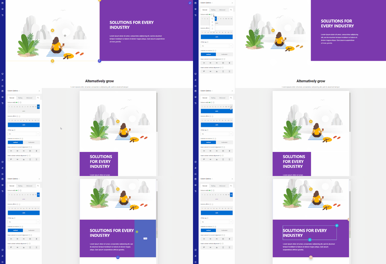
With Zion Builder responsive option your content will be accessible on desktop and mobile devices. No extra steps or programming required.
Control how stacking behaves on different devices, define offsets of your choice, and hide particular elements on specific device types. Take full control over responsive design and get the best possible responsive website.
Responsive Grids
The Zion Builder grid is responsive by default. But if you want the row grid to be different on tablet and mobile, you can use the responsive grid feature. For example, you can set the row grid to a 4-column on desktop, then change it to a 2-column on a tablet, and a 1-column on mobile.

Responsive Styling
Some design options like font sizes, padding, or alignments have to be customized specifically for desktops, tablets, or smartphones, depending on what you need to achieve. The font size is a good example of a web design option that can hardly be identical for a desktop computer and a smartphone.
This problem can be easily solved with the Zion Builder. The user interface of the plugin includes a device switcher allowing you to customize options like the font size for each type of device.