The new page builder plugin
Built and designed by Hogash team, the creator of the famous WordPress theme Kallyas, this plugin comes with tools to build an outstanding WordPress website. Let’s take a look at the most stand-out features this plugin brings to the table and what you, as a user, are empowered to do with them.
1. Elements and templates at your fingertip
Add elements and templates right where you need them from the page builder popup.
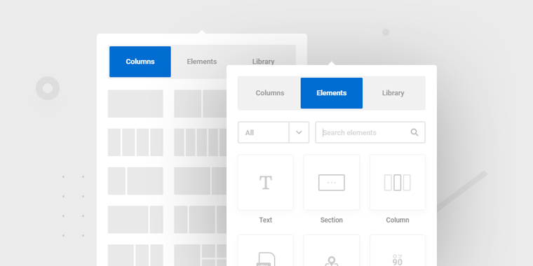
The popup elements is activated by elements from the page, so you can easily add the elements right where you need them. We already prepared some base template layouts that can help you decide the way your section will look.
2. Basic free elements
The builder comes with its own basic elements that can be styled from the element panel.
27 Basic elements that come built-in are text, button, slider, gallery, image, section, column, custom HTML, google maps, counter, progress bars, anchor point, icon list, testimonial, alert, shortcode, sidebar, SoundCloud, pricing, tabs, accordions, image box, icon, icon box, heading, video, separator.
Besides those, the plugin bring also the WordPress widgets which can be added to the page just as other elements.
3. Independent composition of elements
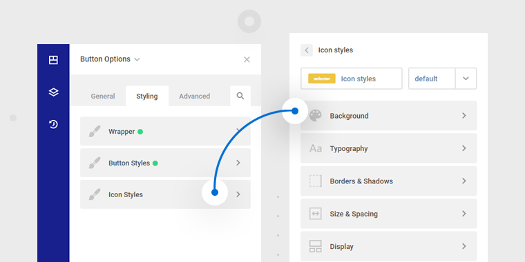
This is Zion Builder’s core competency. Each element is composed of a wrapper and its sub-components. For example, a button is composed of a wrapper, the button, and the icon. Then, the icon can be styled separately from the button. The same concept is applied to the tabs element, accordion, progress-bars, image-box, or the icon-box which are compound elements.
This type of composition gives a lot of power for the user to apply individual styles per each element sub-component.
4. The same styling options pattern
This is the second most important key feature in our page builder. We’ve thought about a new simplified structure – each element has the same easy to use and intuitive options pattern found in the “Element Options” panel.
Until you get used to the options panel, we have implemented a search system, so that you can easily find any CSS rule you need. If you want to go back to the default style, you can easily discard changes for any option that you just changed.
5. Style per users actions
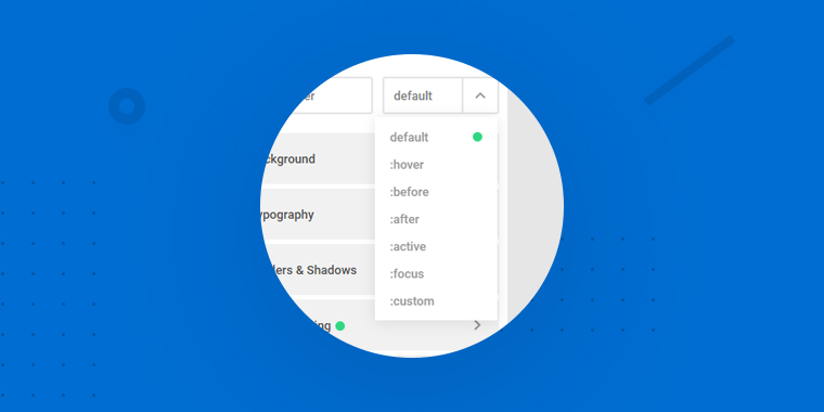
No coding required for style on hover, or on focus. This is when pseudo-selectors come into play. “Hover” state of an element combined with the independent composition of elements brings a powerful design that otherwise would have been achieved only with custom code.
6. Ability to use your own custom resources
You can choose what fonts, colors, gradients, or templates to appear in the page builder. With its own back-end WordPress Management, you are benefiting from all the features of an autonomous plugin, you will be the sole Creator of your website by managing the overall settings, templates, and presets.
7. Full control over posts and actions
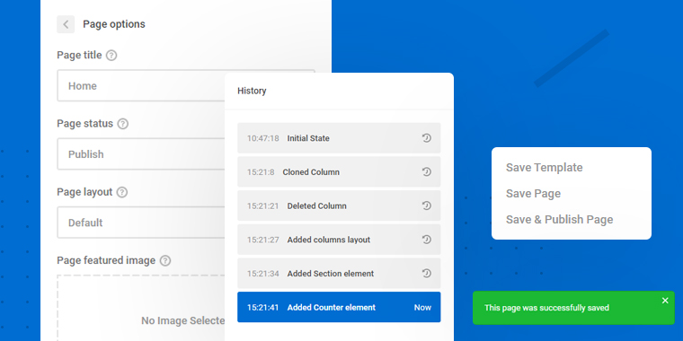
Title, status, layout, featured image are all available in the front-end. You don’t need to go on WordPress dashboard to edit them. The post’s revisions are also saved.
Through the advanced saving system, you are able to save and publish a page, save drafts, or a template. This is what we mean through maximum control over the pages and posts of your website.
While you are in the builder mode, a whole panel is dedicated to the history of actions, so you can always go back or forward.
8. Full control over dragging elements
This is achieved through the stylish toolbar that appears each time you hover an element. The element gets it’s size and spacing changed directly by dragging its toolbox lines.
Also, the system of actions that can be applied to an element is done not only from the top right toolbar, but also from the right-click. The right-click can be triggered from any type of tree-view.
9. Custom workspace in builder mode
The user is able to open, close, drag, and resize the panels according to his needs. There is no constrain when you want to have a “clean” perspective.
If you are not keen into seeing the 1 on 1 view of your elements, the tree-view system offers you the flexibility not only for “reading” but also for “writing” the page map.
With just a shortcut (CTRL + P) you can preview your page just as it looks like in the final rendering.
10. Global styles
Create your own color schemes and apply them to any element from the website. This is when global colors and global gradients come into play.
Having access to your own library of color and gradient schemes makes the implementation of any design on the website much easier. On the same page, you are also able to copy and paste the styles from one element to another.
As extra spice, global CSS classes were implemented so that you can add and customize CSS classes through the system of options. No coding skills required.
11. Increased accessibility
Accessibility is one of the major characteristics of our product, as our target market will be literally anyone who wants to build a WordPress website.
Keyboard shortcuts are of tremendous help while creating a page, so even if you are a newbie with our app, we implemented this with the most used and intuitive keys.
12. Live Responsive editing
Take part in a full live responsive control over your page elements. One-click away to change the design on the mobile, tablet, or other devices, without leaving your current window.
Designing the layout on different devices is more than an enjoyable experience: you will visually decide the sizes, colors, or positioning of the elements for each screen. This means that any changes made to the mobile view, will only be seen on that device and it will not affect the other devices, which will still maintain the original design options.
13. Custom rich text on click
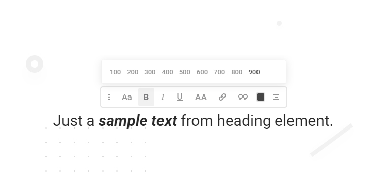
The inline editor is triggered on text click, and provides options such as font family, size, weight, spacing, alignment, or text-transform. Its integration in the page is user friendly and flexible, as you can drag it anywhere.
14. Add motion to elements
If the above features present the dynamics of the builder, it’s time to show what could be achieved for the elements. With an advanced system of options, you can add movement to your elements using the CSS3 animations: slide, fade, zoom, rotate are just a few examples.
15. Design on the grid
The elements are using the flexbox system which you can apply to align your content vertically or horizontally inside columns and sections.
As keyboard shortcuts, holding CTRL key while dragging sizes and margins of an element, sets rounded values to your spacing and sizing options.
The add-elements popup already brings pre-made layouts so you just add elements inside the predefined grid.
16. Reuse the elements across multiple websites – the library system
Once you are satisfied with your design, you are able to reuse it on other posts or websites. The complex saving system allows you to save a single element or a group of elements. The import of the saved elements is easily done through the library panel triggered from the main panel.
The library system has 2 components: the Zion library and the local library. The premade templates already designed by Hogash team make the design process a lot easier as it allows you to use multiple library elements across different pages or websites.
Conclusion
This outline of goals was the key concept attached to the project from the scratch, keeping in mind that the user story is the most important in product development. The features were built accordingly to them, shaping the actual version of Zion Builder.
All the above features are included in the free version of our plugin, so stay tuned till we announce the launch of the Pro version which will include extra power, elements, and options.
If you need a more detailed explanation on achieving the above editing features or what each individual option can do, please read the following documentation:
Leave a Reply
You must be logged in to post a comment.