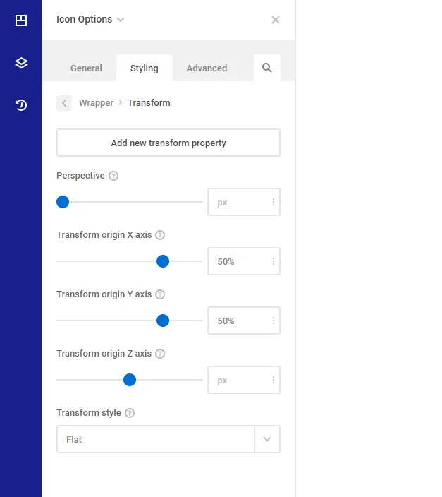
The Transform allows elements styled with CSS to be transformed in two-dimensional or three-dimensional space. Using this property, elements can be translated, rotated, scaled, and skewed. The value list may consist of 2D and/or 3D transform values.
Perspective property doesn’t affect the element itself, but affects the transforms of descendent elements’ 3D transforms, allowing them all to have a consistent depth perspective.
Transform origin property is used in conjunction with CSS transforms, letting you change the point of origin of a transform. As indicated above, the transform-origin property can take up to two space-separated keyword or length values for a 2D transform and up to three values for a 3D transform.
By default, the origin of a transform is “50% 50%”, which is exactly in the center of any given element. Changing the origin to “top left” (as in the demo above) causes the element to use the top left corner of the element as a rotation point.
Transform style property, when applied to an element, determines if that element’s children are positioned in 3D space, or flattened.
Transform Translate property allows you to specify translation transforms individually and independently of the transform property. Moves an element sideways or up and down.
Transform Scale property is for scaling elements.
Transform Rotate property is for making elements move around a fixed point. By default, it rotates around the center of the element.
Transform Skew property tilts elements horizontally. The skewY tilts elements vertically.
Transform Perspective property sets an element 3D space by indicating the distance between the Z plane and users. Smaller values create a more noticeable effect since you get closer from the Z plane. Go with bigger values to generate a more gentle effect.